


Not What I Was Expecting
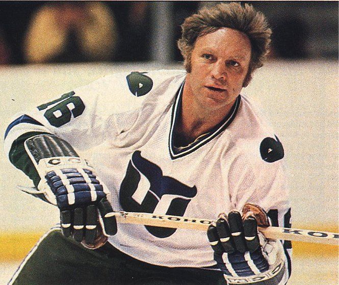
 It's late on a Wednesday night, but I've been waiting for this announcement for a long time. The Whalers Sports and Entertainment group, having been successful in their purchase of the AHL's Hartford Wolf Pack, began their quest to bring the Whale back to Hartford. The image to the left is of the Whalers' center ice design before they started their final game in Hartford against the Tampa Bay Lightning, and there was hope that the iconic Whalers logo, while never being duplicated, could at least have some influence on the new logo that the soon-to-be-called Connecticut Whale will wear.
With baited breath, I waited and waited for this evening. The announcement was made that the Whalers Sports and Entertainment group would unveil the new logo before the exhibition game between the Wolf Pack and Albany Devils this evening, and I've been scouring any news source that may have the new logo available.
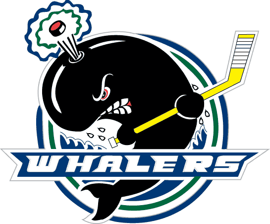
And we finally have it!
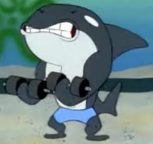
And with that new logo comes the inevitable letdown when comparing this gorgeous logo with this cartoonish, minor-league logo. Even the OHL's Plymouth Whalers have a much more professional logo than what the AHL's Connecticut Whalers will wear at some point in the 2010-11 season, and the Plymouth Whalers are a Canadian junior team!
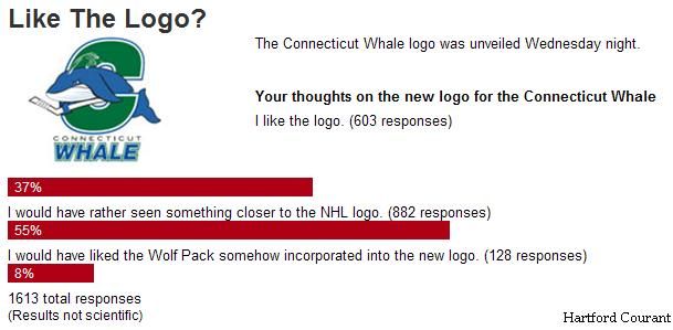
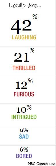
From the way a couple of surveys are going, it appears that this move to change the Wolf Pack to the Whale isn't being met with a lot of support after seeing this new logo. According to the Hartford Courant's online survey, only 603 people have liked the logo thus far out of the 1613 people that clicked on the survey. That's a mere 37% of the people surveyed, and over half of the respondants would have preferred something closer to the NHL logo. Over on the NBC Connecticut's site, their survey shows that twice as many people are laughing in regards to the new logo as there are people who are thrilled. I'm no Marketing whiz, but I'm pretty sure this isn't the kind of groundswell that a new logo and newly-named team wants.
There is some good news for Whalers fans, though. Pucky the Whale will remain as the mascot for the new Connecticut Whale, and that has to be good for fan morale. I've always liked Pucky, and thought he was highly underrated. He is, however, one of the few mascots to actually appear on an NHL jersey, and he even had his own patch!
"We wanted to not only incorporate our traditional Whaler green, but focus on the whale, the official animal of the state of Connecticut," according to Howard Baldwin, chairman of the Whale franchise. No offence to Mr. Baldwin, but when Spongebob Squarepants has a better whale character than your pro hockey team, you're missing the entire point of the exercise. I mean, you don't have to hire Walt Disney to design your logo, but they did a heckuva better job in both Pinocchio and Finding Nemo than what was put forth here. But who am I to criticize? After all, I'm not a graphic designer.
Personally, I expected more from Howard Baldwin's team. He knew how much the Whalers meant to Hartford, and he came up short with this design. Very short. I'm officially going on record here: I hate this new logo. But that's just me.
What say you, readers? What is your take on the new Connecticut Whale logo? Comments are encouraged on this one!
Until next time, keep your sticks on the ice!


1 comment:
Fail! Huge fail. O.k. so I'm old school but please. I realize their target market is the young crowd and not old timers like me but I agree - they had a huge opportunity here and totally blew it.
I have a six year old son. I haven't showed the logo to him yet but I know he will hate it too. He's being raised right! :^)
Post a Comment